ECDF: The Only Plotting Tool a Data Scientist Needs
After reading this article, you’ll never use a histogram again.
The modern data scientist swims in an ocean of plotting techniques. From matplotlib to ggplot2; from plotly to d3.js; from histograms, to box plots, to scatter plots, to whatever crazy chart seaborn comes up with next; it can be hard for data scientists to make sense of it all!
But worry no longer. Empirical Cumulative Distribution Functions (ECDFs) will take you wherever you need to go; they are the one Exploratory Data Analysis companion you truly need; the one that cuts through all the noise; the one that will always be there to reliably illuminate your dark statistical world of not-yet understood data.
What’s an Empirical Cumulative Distribution Function?
I’ve been working in commercial data science applications for 4+ years now, and I can tell you: I rarely see Empirical Cumulative Distribution Functions (ECDFs), except on my own screen. So, in case you’re not familiar, let’s take a moment to explain. From Wikipedia (paraphrased):
An Empirical Cumulative Distribution Function (eCDF) is the distribution function associated with the empirical measure of a sample. This cumulative distribution function is a step function that jumps up by 1/n at each of the n data points. Its value at any specified value of the measured variable is the fraction of observations of the measured variable that are less than or equal to the specified value.
Before jumping any more into ECDFs - and how they relate to histograms - we must first discuss the functions that histograms and ECDFs are designed to approximate: PDFs and CDFs.
PDFs and CDFs
While a Probability Density Function (PDF) measures P(x=X) for a random draw x from some probability function P over some support X, a CDF measures P(x<=X) for that same probability function P over the same support X.
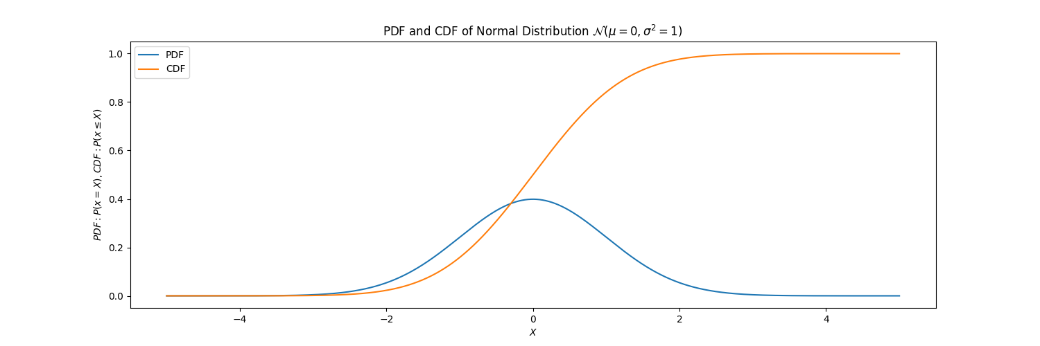
For the calculus fans in the audience, the CDF is the integral of the PDF.
Histograms and ECDFs
Those curves above are theoretical, displayed by plotting the equation for the Normal Distribution.
When we do Exploratory Data Analysis on real-world data though, there is no explicit equation that has generated our data; it has been instead generated by complex processes that we want to understand, leverage, and perhaps even affect. To begin this process of understanding, we often plot empirical distributions of our data; and this is most typically done by plotting a histogram. And, just as a histogram provides an estimation of the latent PDF underlying the empirical data, an ECDF provides an estimation of the latent CDF underlying the empirical data. To demonstrate the difference between a histogram and an ECDF, I use them below to visualize the same 10000 draws from a normal distribution:
# Import.
import numpy as np
import matplotlib.pyplot as plt

# Create data.
mean = 0
std = 1
gaussian_draws = np.random.normal(mean, std, size=n_draws)

# Plot histogram.
plt.hist(gaussian_draws, bins=25, density=True)
plt.show()

# Plot ECDF.
x = np.sort(gaussian_draws)
y = np.linspace(0, 1, len(gaussian_draws))
plt.plot(x, y)
plt.show()
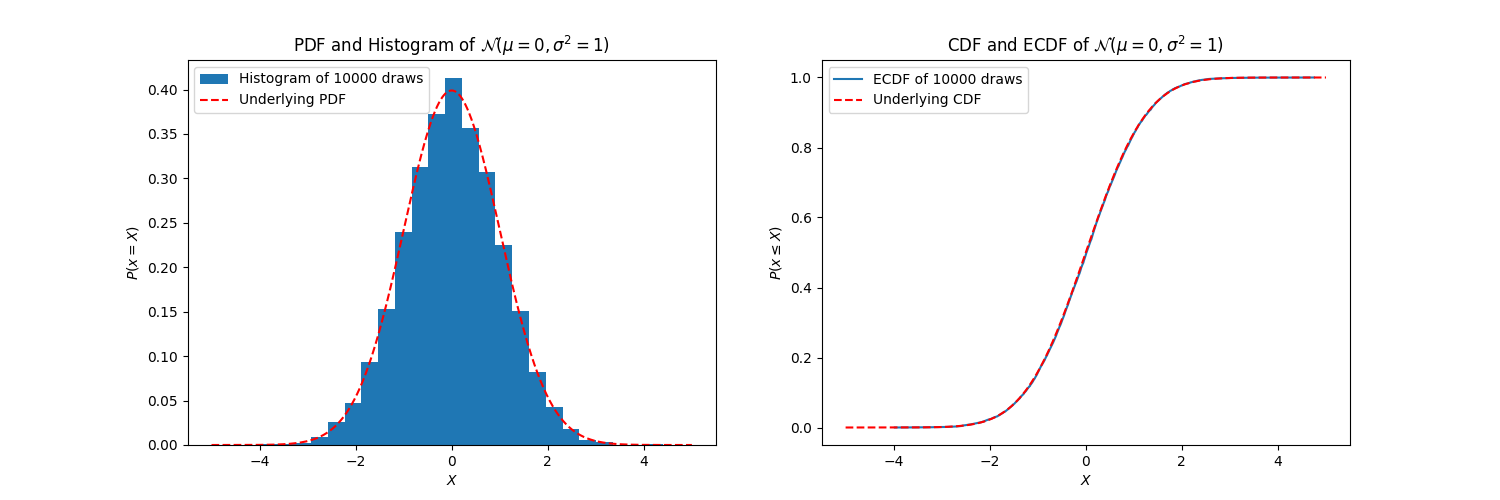
Histograms can be nice in their immediate visual interpretability, but their list of benefits ends there. It pays to learn to love ECDFs, and I can convince you in 5 reasons.
5 Reasons Why ECDFs Render Histograms Obsolete
1. Key Quartile Values Become Immediately Obvious
What do I mean when I say “Key Quartile Values”? I mean:
- 0th percentile value (i.e. minimum) of the data;
- 25th percentile value of the data;
- 50th percentile value (i.e. median) of the data;
- 75th percentile value of the data;
- 100th percentile value (i.e. maximum) of the data
This information is readily codified into both box plots and ECDFs, but it is quite ambiguous in histograms.
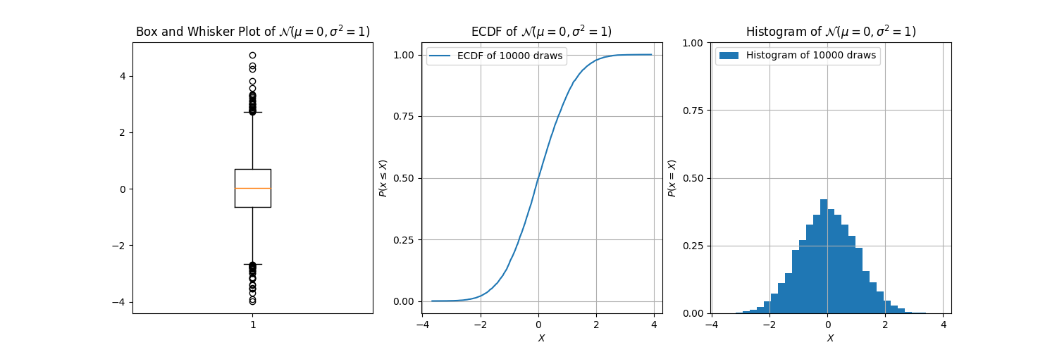
And there it is. We can see:
- from the box plot, that the 25th percentile is about
-0.6, the median0, and the 75th percentile about0.6; - from the ECDF, the 25th percentile is about
-0.6, the median0, and the 75th percentile about0.6; - from the histogram… well, we can’t really see much. We can guess that the median is at about
0, but that’s about it; and, we can only guess the median because of the symmetry of the data.
That’s right, folks! With all this talk of histograms, I forgot to mention: the box plot is decidedly redundant! Though it’s true that it can do something that the histogram cannot, it is but a shadow of the ECDF.
2. ECDFs Remain Relatively High-Integrity Under Low Data Volume
In the prior section, we considered data of 10,000 draws from a normal distribution. How do things start to look when we decrease the amount of data? Let’s have a look:
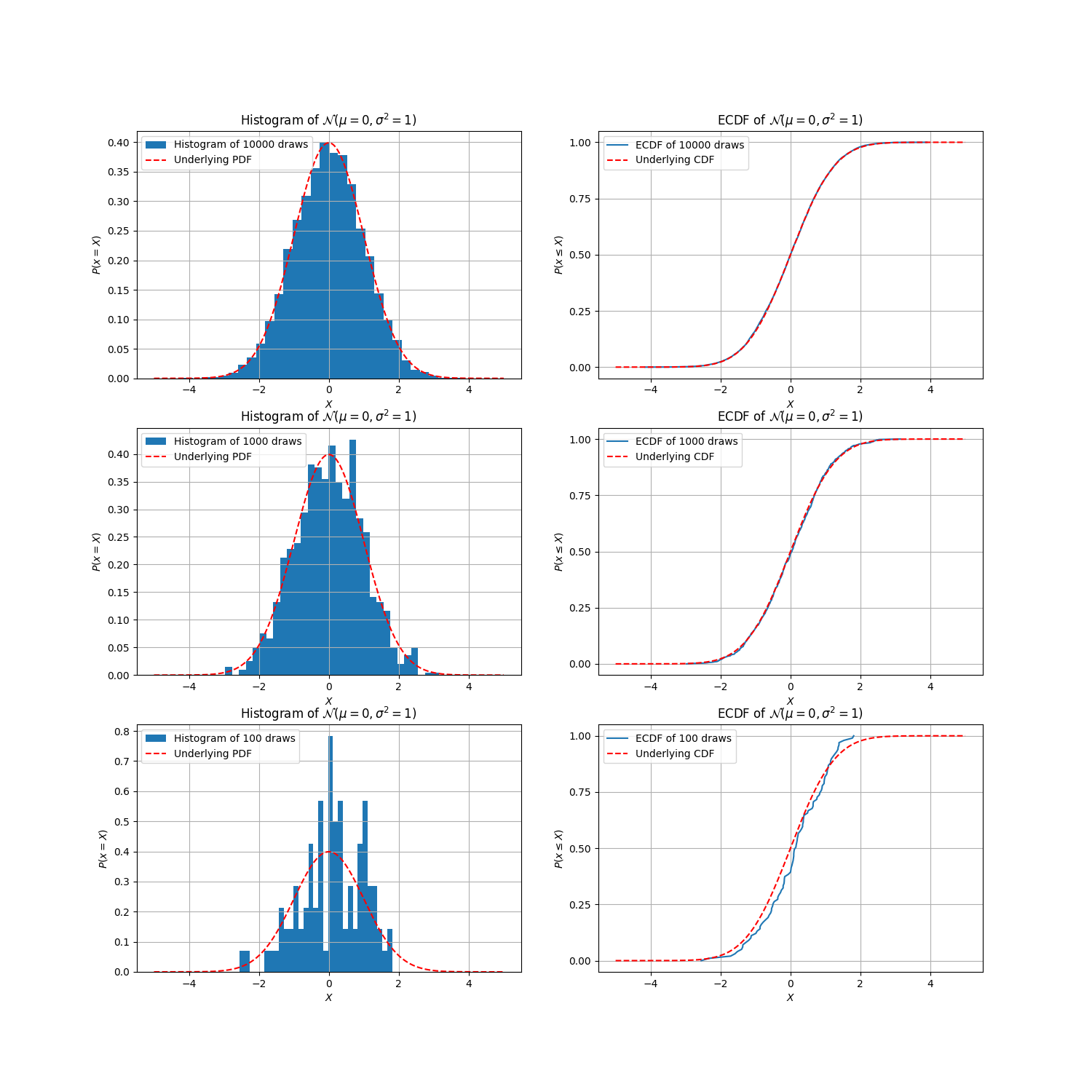
Histograms do a pretty good job of estimating the latent PDF for 10000 draws, and even for 1000 draws; but at 100 draws, it’s starting to look a bit dubious. In fact, if I didn’t know how this data was generated, I can no longer say with much confidence that it’s a normal distribution! The ECDFs, however, remain far more robustly adherent to the underlying CDF, even at 100 draws.
You might be wondering to yourself now, “But Ben, why don’t we just increase the bin size? Wouldn’t that smoothen the histogram, and then it would look like our latent normal distribution again?” Yes, it would, but it then begs the question: how do we decide how many bins to use?
3. With Histograms, You Never Know How Many Bins to Use
Let’s indulge ourselves for a moment: what would the histogram from above look like if we decreased the number of bins?
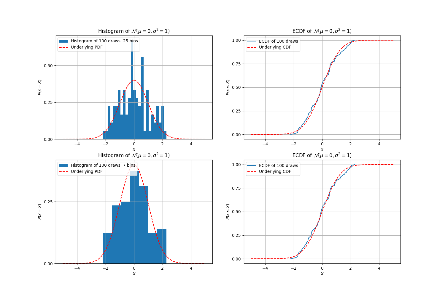 While the 7-bin histogram is still not quite convincingly the normal distribution that we know it to be, it’s nonetheless more convincing than the 25-bin histogram. But here’s the thing: regardless of how good the histogram can look if you get the number of bins right, an ECDF doesn’t require this guessing game at all!
In this sense, “number of bins” or “bin size” becomes a sort of hyperparameter. And Exploratory Data Analysis is a time for understanding your data in all its richness as quickly and effectively as possible; it’s not a time for tuning hyperparameters.
4. The Perils of Binning Bias, or “Are You My Outlier?”
Let’s say you still want to use a histogram. So, you simply decrease the bin size to accommodate whatever your data volume is, until you get it looking perfect.

If that’s your approach, then be warned: if your data has outliers, then your histogram might be lying to you.
In the following charts, I’ve taken the same Gaussian sampled data from above, but manually added an outlier. Let’s see how the outlier looks in a histogram, depending on the number of bins we use:
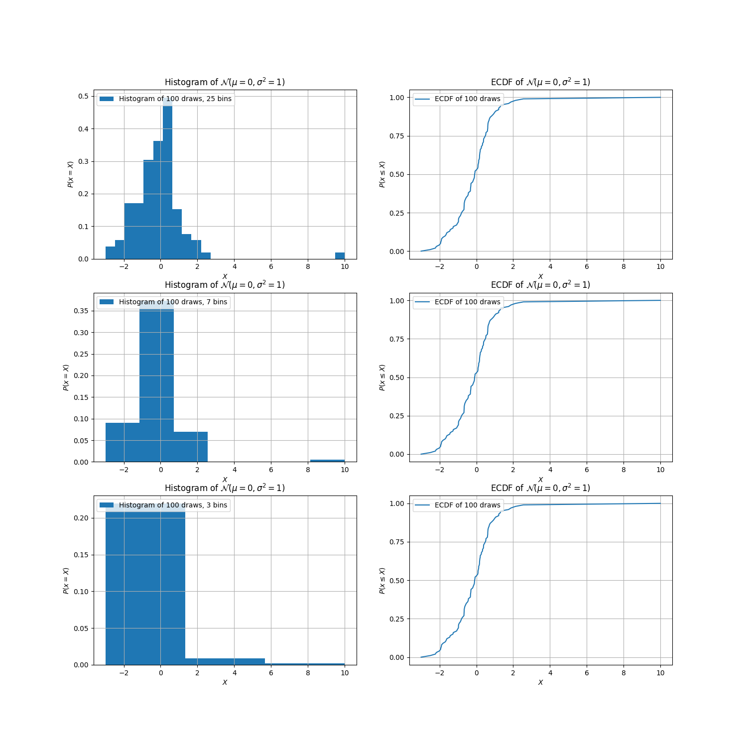
Depending on the number of bins, the perceived nature of the outlier and the latent distribution underlying the data completely changes:
- When we use
25bins, we see an outlier out atX = 10. But, the bins appear a bit noisy, so we decrease to7bins. - When we use
7bins, the hypothesized PDF is smooth, but now the outlier is out atX = 9. What happened? Where exactly in the bin is the outlier? Is it even an outlier? - When we decrease to
3bins, the outlier skews the entire distribution, so much so that it doesn’t even look like an outlier anymore! It also becomes dubious: might this not be a normal distribution? Is it exponential or log-normal?
With the histograms, we see the outlier creep closer and closer to the main body of the distribution as the number of bins decreases. However, if we look to the corresponding ECDFs, there is no ambiguity whatsoever: by X = 2.5, we’ve seen 99% of the data; then, the CDF traces out a long, almost horizontal line to get to the singular outlier at a value of X = 10. Voila!
5. Comparing Empirical Distributions Becomes More Straightforward, both Mathematically and Visually
…don’t take it from me, though; take it from Andrey Kolmogorov and Nikolai Smirnov, the creators of the Kolmogorov-Smirnov Test (K-S Test), one of the most commonly used tests for comparing two empirical distributions. From Wikipedia:
In statistics, the Kolmogorov–Smirnov test (K-S test or KS test) is a nonparametric test of the equality of continuous, one-dimensional probability distributions that can be used to compare a sample with a reference probability distribution (one-sample K–S test), or to compare two samples (two-sample K–S test)…
…The Kolmogorov–Smirnov statistic quantifies a distance between the [ECDF] of the sample and the [CDF] of the reference distribution, or between the [ECDFs] of two samples…
…Intuitively, the [K-S] statistic takes the largest absolute difference between the two distribution functions across all x values, [represented by the black arrow in following image]…
ECDFs are not only useful for visual comparisons; they are also useful for statistical comparisons. Histograms, however, by necessitating aggregation-by-binning, are strictly visual tools.
But even as visual comparison tools, ECDFs are just as performant as histograms, if not more so.
Take, for example, data about people’s heights and genders from a dataset of all athletes from the 2016 Rio de Janeiro Olympics, hosted on Kaggle. In particular, let’s see how heights compare across Male and Female sexes, using Seaborn’s four different methods for comparing two histograms:
# Import and load.
import seaborn as sns
import pandas as pd
import matplotlib.pyplot as plt
athlete_df = pd.read_csv("athletes.csv")

# Create figure.
fig, axs = plt.subplots(1, 4, figsize=(20, 5))

# Plot a separate distribution for each sex.
for i, hist_type in enumerate(["layer", "dodge", "stack", "fill"]):
    sns.histplot(athlete_df, x="height", hue="sex", multiple=hist_type,
        shrink=.75, ax=axs[i], bins=25, stat="probability")

# Display
plt.show()

Which one looks the best: showing bars side by side, overlapping bars, stacking bars, or the nauseating “fill” approach all the way on the right? With ECDFs, there’s one clear method:
# Plot a separate distribution for each sex.
for sex in athlete_df["sex"].unique():
    x = athlete_df[athlete_df.sex==sex].height.sort_values()
    y = np.linspace(0, 1, len(x))
    plt.plot(x, y, label=sex)

# Display.
plt.xlabel('height')
plt.ylabel('CDF')
plt.legend()
plt.show()
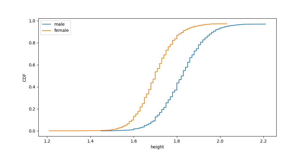
It’s just easy.
Conclusion
When we include all these things together, an ECDF tells you everything you need to know about a dataset’s distribution:
- the key quartile values;
- the distribution shape;
- precisely where any outliers are;
- how the data compares to other data, or to theoretical distributions;
…and it does so with incomparable clarity and beauty.
With all this, the ECDF is a looking glass through which a dataset can reveal to you all its secrets, unobfuscated by any binning.
Of course, ECDFs and histograms still have many brother and sistograms: there are other plotting tools out there, many of which serve vastly different functions. For just one example, scatter plots are mostly used for getting a first look at correlation between two joint columns of data, something which histograms and ECDFs can’t do. That said, if your goal is to gain a full understanding of one column of data in all its peculiarities, or to compare two columns’ empirical distributions, then there’s simply no match for the ECDF.
PS: All code used in the creation of this post can be found here.
Liked what you read? Feel free to reach out on , , , , and .
